The good news is that we live in an age of data, so there are many Coronavirus dashboards that will help you. These are the four best examples to help you know what’s going on and how you should plan your movements.
Security Alert!
It seems that no matter what disaster we have to deal with, there will always be people who try to profit from it somehow. Sadly, hackers and creators of malicious software have taken to creating convincing Coronavirus dashboard sites that actually steal your data or infect your computer with malware. Always double check the address and make sure you’re using the legitimate site.
The WHO Dashboard
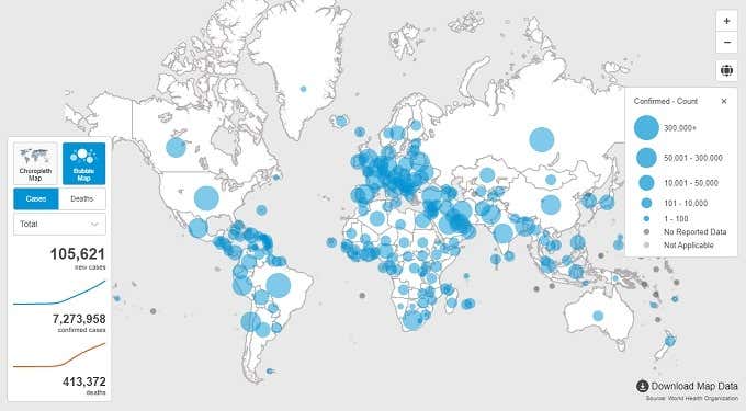
Let’s start off with a Coronavirus dashboard that’s probably where many other sites are getting their information. So why not get it straight from the horse’s mouth? The World Health Organization is the central institution helping governments coordinate and strategize against the COVID-19 pandemic. Their site is minimalist, has all the most important information right there from the start and you can easily narrow down to any region of the world you want to see simply by clicking on it. The WHO has also included a mode that shows only deaths from COVID by region and a bubble map mode which shows you the relative scale of cases by country at a glance. If you scroll down from the main map, there are well thought-out breakdowns of data to help you understand what’s going on on a global stage.
The Google Dashboard
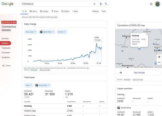
If you search “coronavirus”, you’ll go straight to Google’s own overview page. It pulls together all the relevant information Google can find into one place. The Google service is a little slapped together and it can be a little confusing for a second, but once you get what Google is trying to do it all makes perfect sense. The “Overview” tab hits you with important breaking news related to the pandemic, but the actual map is squirreled away on the right of the page in its own little box. If you click “View full map” you’ll be taken to a dedicated map page, starting with the location Google detects for you. This is clearly built on the existing Google Maps foundation, so if you’re used to using that system then this map already feels pretty familiar. The map is incredibly easy to read and provides data by state or province, depending on the country and the data in question. Heading back to the first page and choosing the “Statistics” section, also gives a simple breakdown of infection trends over time. Google pulls data from several different sources as well, so it’s worth comparing its numbers with other sources if you’re in doubt. Google has also included information about symptoms, treatment, and prevention right at your fingertips. It’s a great dashboard to share with friends and family.
The Bing Dashboard
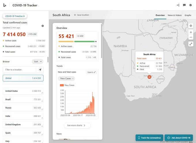
Not to be outdone by Google, Microsoft’s Bing also has a COVID-19 tracker on offer. If we’re being honest, it’s much better from a design and interface perspective. Unlike the Google offering, this seems like a site that was designed as a cohesive whole. Of course looks don’t mean all that much if the data is bad, and perhaps Bing doesn’t communicate the statistics quite as effectively as Google does at first. However, once you know what you’re looking at it becomes pretty simple. The map popup summary in particular is a nice touch, showing a concise breakdown of the big numbers associated with each region. Bing’s map uses the bubble format to show the number of cases in each region, which is fine as long as you don’t interpret the circles as geographical spread.
The Johns Hopkins University COVID-19 Dashboard
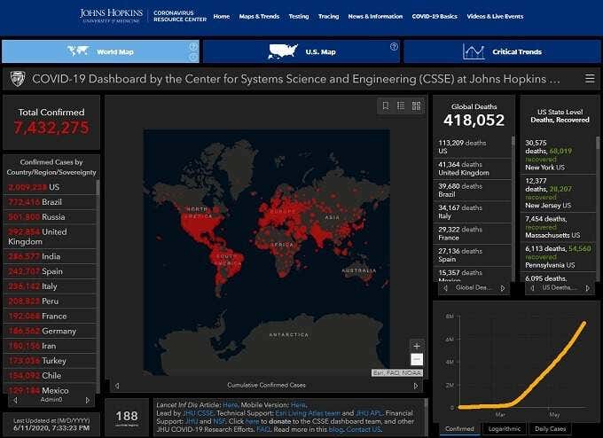
The Johns Hopkins University of Medicine is quite possibly the most famous medical institution in the world and they took no time at all to develop and make available a sophisticated Coronavirus dashboard in the form of a COVID-19 map. In terms of visual design, this looks like it would be at home in a Hollywood military thriller, but if you can get over the depressing color scheme you’ll find one of the best pandemic maps available. One thing we really liked is the ranked list of cases by country on the left of the map.This immediately shows you which countries should be at the top of your list when it comes to travel concerns. On the downside, only the US gets more detailed area data via a dedicated map. So this Coronavirus dashboard is going to be of most use to US residents or those looking for data on the pandemic in the US. If you are a US resident, the information provided by the Johns Hopkins map is invaluable and we recommend bookmarking this site as a first port of call whenever you’re wondering what’s happening in your country.
Stick To The Basics!
It’s wonderful that so much information is available to us in a time of crisis such as this. However, no matter what the current statistics say, it should make no difference to the basic steps each and every person should take to limit the effects of COVID-19:
Stay at least six feet away from other personsWash your hands frequently with soap for 20 seconds or with alcohol-based hand sanitizerWear a cloth masks at all times in public to curb asymptomatic spreadSanitize surfaces such as door handles regularly
There is currently no vaccine and no approved drugs to treat severe cases of COVID-19. Your best defence is therefore to prevent infection in the first place. COVID-19 is spread through droplets containing the virus and typically enters through the eyes, nose and mouth. Only take advice from your government health officials and organizations such as the World Health Organization. Do not share false or unproven claims about COVID-19 on social media or in private messages. If we can all change our collective behavior, this pandemic can be beaten. Stay safe!


